Top 6 White Paint Colors To Use Today
Great American decorator, Elsie De Wolfe said “I believe in optimism and plenty of white paint.” One look on Pinterest and there is no escaping it. White paint is still going strong- White Hot in fact. White can be a beautiful backdrop for artwork and can make a space feel like a breath of fresh air. While white has been around for a while (Benjamin Moore’s Simply White was the color of the year in 2016) I am seeing a shift to warmer palettes. I think in general, softer whites tend to be more forgiving and easier to work with. Crisp white and gray are classic and will always be part of the conversation, but I think we are seeing a shift to warmer grays and greiges and creamier whites. Here are a few tried and true whites that I am loving right now.
Simply White - Benjamin Moore OC - 117
The 2016 Benjamin Moore color of the year still remains a strong contender. A soft, clean white with a hint of warmth was perfect for a recent dental office refresh pictured below.
The leaves in this paper, created by Danika Herrick for Spoonflower, are custom colored Benjamin Moore’s Simply White to coordinate with the walls and trim throughout the dental practice.
White Dove - Benjamin Moore OC-17
A classic soft shade of white that is great for walls, trim and ceilings. It works well with most colors and was the perfect color for this lovely young ladies bedroom.
White Dove used here on the cabinets and trim worked seamlessly with the wallpaper.
Delicate White - Porter Paints 518-1
Both of the above images are from pencilandpaperco.com
Delicate White is a pale, true, white with a non-existent undertone. It pairs well with almost any color. It works especially well in crisp palettes with black accents.
Swiss Coffee - Benjamin Moore OC-45
Image via Studio McGee - Cove Remodel
A creamy warm white that never looks stark. It is a current favorite of mine for walls, cabinets and trim. It has worked well for me in several different spaces with varied light. It’s shown above in Studio McGee’s gorgeous Cove Remodel project.
Benjamin Moore Chantilly Lace
Image via designing vibes.com
A crisp, clean white with blue and gray undertones. If you are looking for a white white this is the winner.
China White - Benjamin Moore OC-141
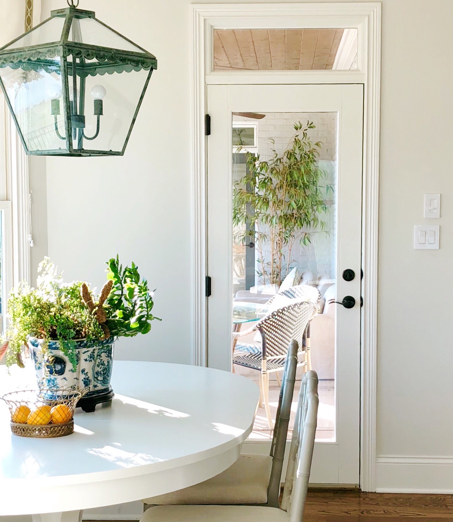
China White is a soft, sophisticated and versatile white that I have used throughout my home.
As with all paint, picking the right shade for your project can be difficult. Remember it’s so important to test a color in your space. Paint at least two large boards and move them around your home throughout the day so you can see how the changing light affects the color. What looks good in one space may look totally different in another. If you need help making a decision, go to the services section of this website and set up a discovery call. I offer a wide variety of services including a paint consultation.
Thanks so much for reading!


